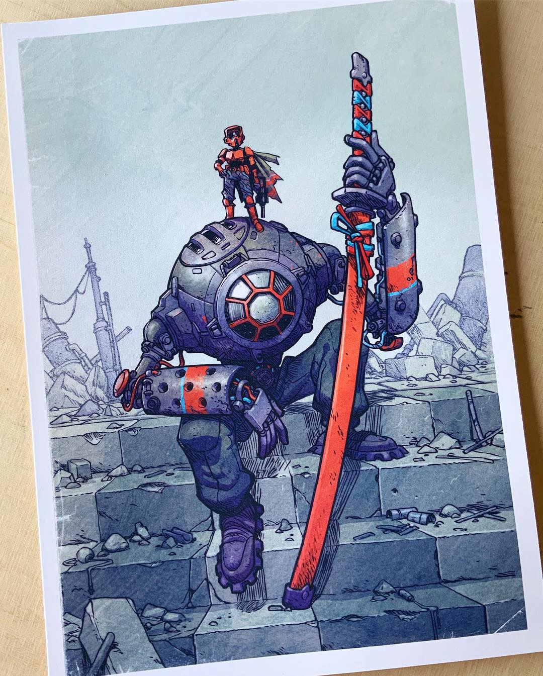
How it was made
Since a few people have asked me how this image was made, I thought I’d take a minute (a couple hours actually) and I write up an old school process blog post. I used to do these every so often back in pre-social media era. Nice to be back at it again.
Over the years I’ve refined my process as more tools have become available to me. I float between digital and traditional all along creation of a piece.
However, most of these fancy tools are just there to help speed up the process or make the work a little easier. You by no means have to have a $2000 scanner, a $1000 printer, and a $1300 iPad pro to accomplish what I did here. A cheap printer, an okay scanner, a lightbox, and a computer that runs photoshop are all that I had for years.
Okay, let’s get down to it:
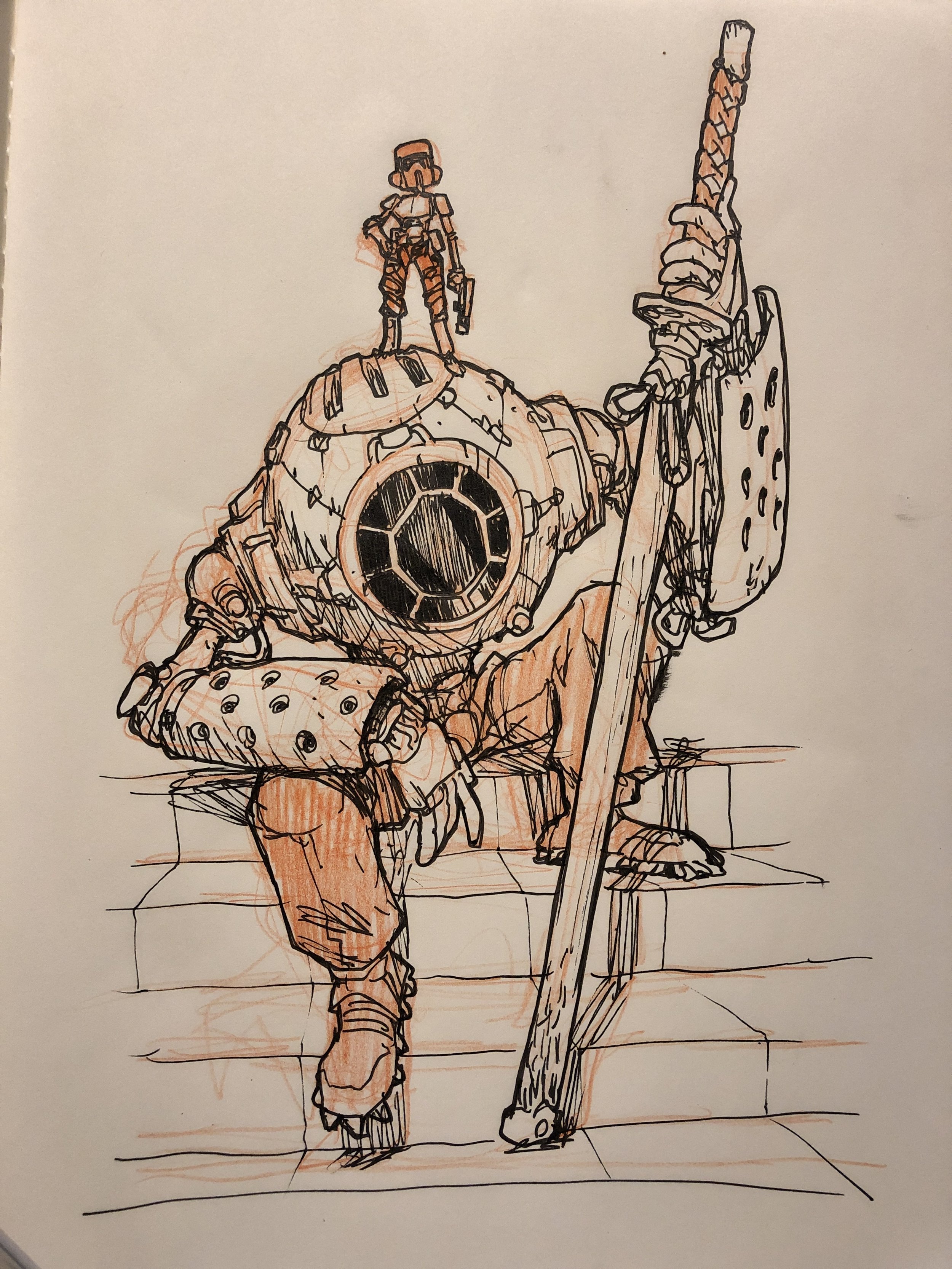
Step 1 - Initial Sketch
Initial sketch done in my sketchbook.
The initial sketch was done early one morning in my sketchbook. You can see it’s loose, raw, and full of energy. At this stage I’m only really interested in getting a solid vibe of what I want to do for the final. The Underdrawing was done with a vermillion pencil, then inked with a standard technical pen.
Step 2 - Line Drawing
Next I scanned my drawing and imported it into Procreate. I dropped the opacity down and did a more refined line drawing over the top of it.
I bought myself an iPad Pro a few months ago and found that it’s been a great tool for getting some drawing done outside of my studio. I also find myself preferring to draw on it than my Cintiq. Here’s the final line art from Procreate:
Step 3 - Polish Line Art in Photoshop
After getting the line drawing to a point where I felt good about it I brought into Photoshop to see how it looks on my computer monitor. What I realized was the samurai sword was straight, and I felt like making it curved would ad a nice graphic element to the piece as well as be more accurate to the nature of samurai swords.
Step 4 - Printing the Linework
Once the line drawing was finished I printed it out on a sheet of 11x17 card stock. I use an Epson P800 (another recent purchase) to make all my prints and to print artwork I’ll be inking on.
Note: If you’re going to buy any Epson printer I recommend buying from an official distributor, NOT amazon.com. Sometimes you might get a bad printer, or something might break on these intricate machines. If you bought it on Amazon you have little recourse for replacement or fixing. Buying from a distributor gives you more options if one breaks.
I print the artwork at a 40% opacity.
Step 5 - Inking
I inked this piece with a Copic Gasenfude brushpen. It’s a solid waterproof brushpen with springy bristles that make for smooth lines. Highly recommend it.
I ink my pages from left to right because I’m right handed and it means less smudging. I usually do all the contour lines first.
Then I’ll finish with adding all the hatching to define form, texture, and shadows.
Step 6 - Scan and Clean Up
About 6 years ago I got a big paycheck for a job and immediately bought an Epson 10000xl scanner. It’s been one of the best purchase I ever bought. I used to have an 8x11 inch scanner and becasue I’m always working at 11x17 I had to scan every comic page 3 times and stitch them together. The time spent doing all the photoshop stitching adds up and I decided that when I had the extra cash I’d get a scanner like this. Worth every penny.
I scan the artwork in at 400ppi as a jpeg file.
Once scanned, the art looks like this:
The reason I scan the image in at 400 is because of the threshold adjustment. What this does is it looks at your image and decides if each pixel is dark enough to be a black pixel or light enough to be a white pixel and it divides you image up into just black and white pixels. If you zoom in close the lines look crunchy because there’s zero anti-aliasing. I usually just OK the threshold at the default level:
Once it’s finished you have some crisp linework to color:
Step 7 - Color
Color theory is hard. To hard to explain in this post. I can’t tell you how I arrived at these color choices, because my path there was messy, and fraught with indecision. Once I figure out the colors the rest is pretty easy. There’s 4 parts to this and I won’t go into too many details here. I’ll save that for an in depth color tutorial some day.
Part 1: Flat color
I set my linework to Multiply and do a flat color pass under the linework on a separate layer.
Part 2: Shadow pass
I use a dark purple and draw shadows over the color. I set these layers to Multiply and drop the opacity to 30%. Here’s the shadows without any linework or color:
Part 3: Light Pass
I have a few layers for different levels of light. These are set to either Overlay or Normal. Opacity differs depending on how much light I want. Here’s the light layers over black:
Part 4: Texture and line effects
I then add a texture and I usually make another line layer with a slight blur to it to make the lines richer.
And here it is all put together:
Close up:
Thanks for checking out this process post! Let me know if you have any questions, and please let me know if you want more stuff like this.
This print is available for a very limited time through Art Drop Club. You have until April 30th to join Art Drop Club in order to get this print along with a bunch of other Star Wars inspired artwork.
Thanks,
Jake


