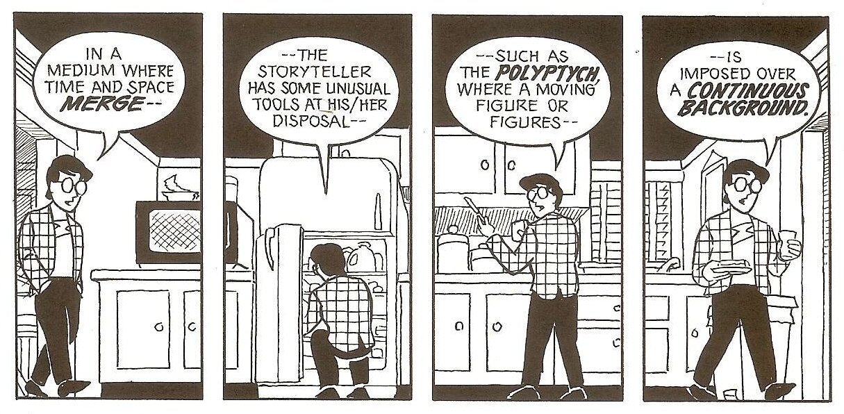
In Scott McCloud’s Understanding Comics there’s a section in chapter 4 on Time Frames about the “polyptych” in comics. I’ll let him do the explaining:
He then draws a nice example of how a single image works to tell a story and move us through time and space regardless of gutters and panels:
I wish comics artists (myself included) did a little more of this. It's something you can't do in film or prose. We artists have a ton of cool story telling tools unique to the art form of comics that we're neglecting in favor of animation style storyboarding techniques.
With that, here’s several examples of the polyptych in comics. From this twitter thread.
By @NickDerington, @Dragonmnky and @BRIANMBENDIS
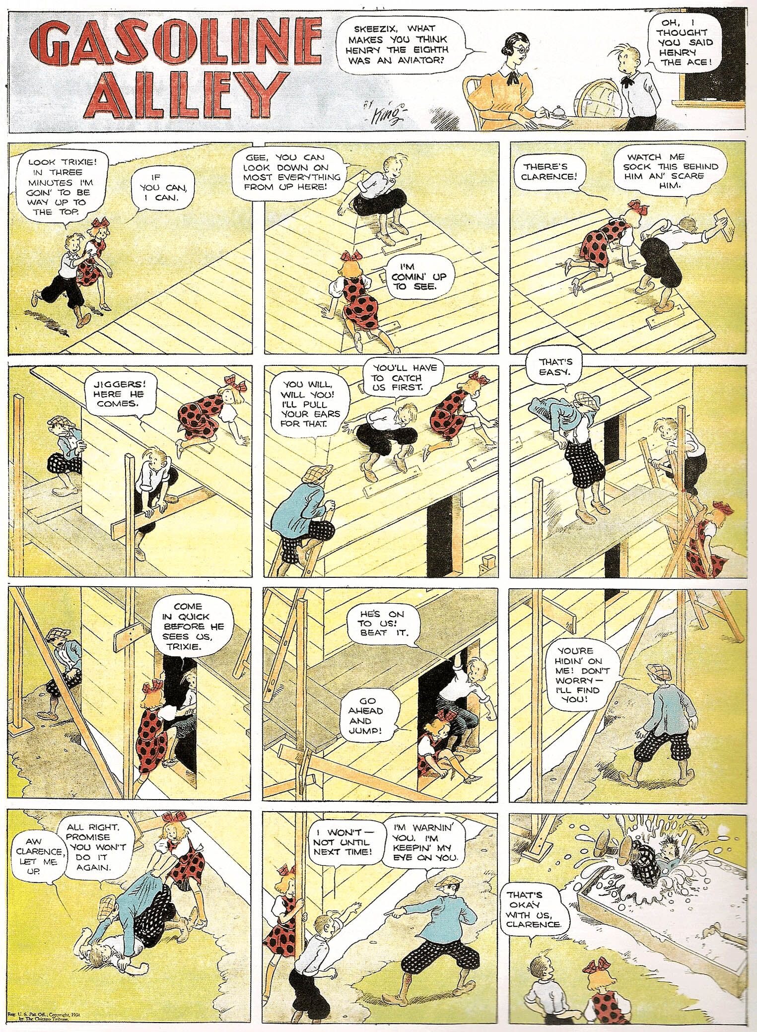
Crazy Quilt: Scraps and Panels on the Way to Gasoline Alley LINK
Gasoline Alley by Frank King LINK
By Gianni de Luca
By Gianni de Luca
By Gianni de Luca
Lewis Trondheim's Les trois chemins
La Jeunesse de Mickey by Tebo LINK
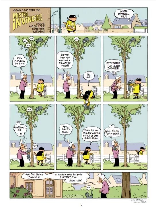
From Mr. Invincible: LINK
Moon Knight
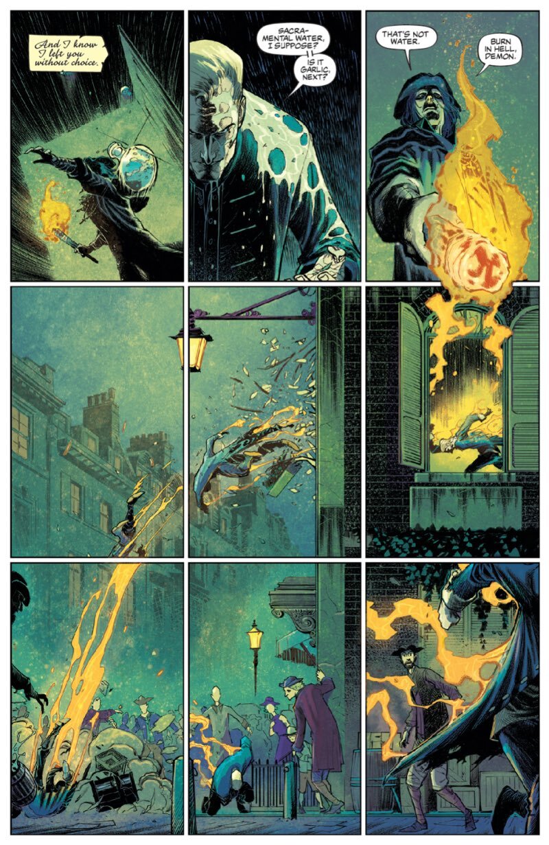
From These Savage Shores
Saving these here so I don’t forget about them. Really want to try this out in my next comic.
-Jake


